Butter London's The Black Knight - weekly nail review

All week I anxiously waited for Essie's new Fall 2011/12 colours to appear at French Pink, alas they were nowhere to be seen.  The girls theorized the delay had something to do with HQ wanting to release the new colours once it was truly fall here.  Once March rolled around, it would appear as through a switch was flipped and bang, smash, boom - fall has sucker punched us all in the face.  To add insult to injury, last Saturday was the absolute antithesis to the weekend before that.  We went from sunny and hot to cool and rainy; I've never seen people bundle up so quickly.  People, Australia has nothing on cold weather extremes.  It really is a walk in the park here, you just might need to carry an umbrella for showers not forecasted. I matched my nails to my funky mood - dark, stormy and a tad bent out of shape.  I was coming off a roller coaster ride of a month; February really didn't happen in my book.

Butter London's The Black Knight was another new arrival I opted to go with.  It's a semi-sheer black base with flecks of pink, blue, silver and black glitter.  Janice painted on two coats and let me tell you she had a heck of a time getting it off today.  Everytime I looked at my nails, I couldn't help but think of the packaging for Britney Spear's perfume Curious.  I'd like to think she'd go for this edgy, but fun shade.

Burberry Beauty Spring 2012 review

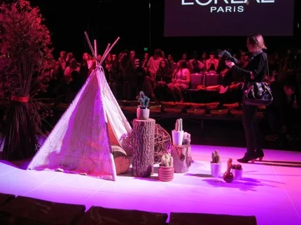
As January came to a finish, I started receiving notifications about the latest Spring collections about to hit the local beauty counters; keep in mind it's now Autumn here.  Lucky for me I had something fresh in my mind about what I wanted to purchase, because you can always count on pastels to make a re-appearance every year.  I really needed to separate the wheat from the chaff; why go for the typical when you can have the extraordinary?

I booked my appointment, paid my booking fee and waited with bated breath for the 11th of February to roll around.  Champagne was on offer when I arrived, but I couldn't fathom even one drop as I was still full from breakfast.  And then the waiting commenced, I may've gotten there a few minutes early, but the customers seemingly outnumbered the artists - I later learned the artist who was to work on me was a tad late. Eventually, I was left in another artist's capable hands.  We chatted for a few moments and settled on using Burberry's newest colours.  I was dying to try Pale Barley eye shadow after reading Karen's, of MBB, review; I am always on a quest to find a beautiful, but subdued neutral.  MAC's shroom and I go back to my days in college and Covergirl's Tapestry Taupe was a shade my mom purchased for me when I was 14-years-old.  If you're looking for a dupe to Burberry's Pale Barley, definitely go for the latter.

For close to 45-minutes I was pampered even though I had nowhere special to go that day.  After inspecting the artistry, I narrowed down the potential winners; I couldn't afford to invest in everything we tried!  For my lips we went with Primrose Hill Pink No. 30 (not to be confused with Butter London's nail polish), Blossom Blush No. 5 for my cheeks and a smoky duo of Pale Barley No. 22 and Midnight Brown No. 21.  From there I whittled down the contenders a bit more and I decided to just go with Pale Barley eye shadow and Primrose Hill Pink lippie; for good measure they threw in a miniature version of Rosewood No. 4 lipstick.

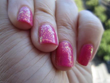
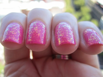
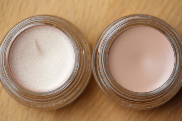
Pale Barley is a buttery cream with a hint of gold; it's great to wear alone or paired with another shade for more depth and variety.  Most mornings, I pop this shade over a good eye primer, coat my lashes, dust a random blush on my cheeks and fill in my lips with Primrose Hill Pink.  In just under five minutes I am good to go.  As for Primrose Hill Pink, the colour matches that of its name - creamy pink, soft and lasts about four hours.

The Bagful breakdown:

Total amount for Burberry Pale Barley and Primrose Hill Pink:

  • $45.00 and $49.00 AUS respectively

Value for money spent (performance and quality):

  • 8 out of 10 bags - cost is a major factor here

Likelihood to purchase again:

  • I'm good for a while now.  Even though I recieved another invite to check out their Luminosity range, I think I can manage to get by for the time being ;)

L'oreal Melbourne Fashion Festival - Runway 3

Fashion week might be over in New York, Paris, London and Milan, but in our little city of Melbourne, we too celebrated the shift of the seasons.  L'oreal's Fashion Festival ran between 8-15 March and I was lucky enough to attend Paris Runway 3 and 4.  Up until now, I had never been to a fashion show and I knew I should probably dress accordingly.  What can I say, any excuse for me to go shopping is good enough for me. Here's a glimpse at what I wore.

After hunting around for close to two hour on Sunday afternoon, I stumbled across this dress at Gorman.  I had seen it before, but decided not to try it on; I took finding it again as a sign.  While waiting in line for a fitting room, I was told by one of the sales associates this dress makes everyone look good.  Sold!  I'll do anything to conceal my hips.  As I was checking out, the same sales girl asked me what the special occasion was and I mentioned that I was attending a fashion show.  It just so happened that I picked out a local designer who was showing that same night (I never checked the program).

For the first night I sat in the second row and had a pretty good vantage point.  Truth be told, the girl who sat in front of me made it difficult to see at times.  Case in point...

gorman

gorman

My first goal was to survey the crowd in order to catch glimpse of someone famous and I ended up spotting Matcho of Australia's Project Runway Season 3.  I'd like to think he was a fan favourite thanks to his personality and charm.  I thought to myself, "should I go ask him for a picture, or should I leave him alone."  For a few moments I sat there, starstruck, but my courage lifted me off of the uncomfortable timber bench and willed me to ask for a photo of the two of us.

Matcho and me

Matcho and me

And yes, I think he wore a koala-type accessory around his neck.  Perhaps he wanted to pay homage to an Aussie mascot - I'll never know. I was honestly hoping for crazier glasses, because he switched them up on a weekly basis.    After getting the goods, I then wandered back to my seat and waited for the show to start.

Floral headpiece

Floral headpiece

and a bit more

and a bit more

I didn't get to snap the best photos, because my shutter couldn't handle the clip at which these models walked.  In less than 20-minutes, we saw six designers and were then quickly whisked into the night; for some, assorted parties awaited their arrival, but for the rest of us (like me) snagged a shuttle bus back into the city.  On a side note, this shuttle bus wasn't ordinary, oh no; gift bags were left for each passenger and were filled to the brim with all sorts of coupons and goodies.  I'll be sure to share my makeup look in another post.

Until then, here's a look at a few pictures I snapped and a video of the final walk.

sponsored by...

sponsored by...

L'OREAL

L'OREAL

And a video!


Essie Shine of the Times over Funny Face - weekly nail review

Looking to transform your nail polish collection, then look no further with Essie's Luxeffects collection.  Initially released for the 2011 holiday season, we're now being graced with these dynamic top coats on the other side of the Pacific.  It truly was a pleasant surprise to see these in French Pink, as they are somewhat of an urban legend in the US due to the shelves being raided by polish fiends and nail enthusiasts. I first came across one variation of the flakie polish here, but never gave it a proper go as I get my nails done on a weekly basis.  Now I don't have any excuses to not wear it.  Heavy on dimension, depth, and personality - flakie top coats really add that extra sparkle to one's overall appearance. The opalescent shine lends itself to a myriad of colours; by pairing it with anything from the rainbow, it can truly give you endless options and be transformative as it wears you.

For my base colour I went with Essie's Funny Face, a punchy pink that smacks of raspberry.

Depending on how the light hits your nails, you can catch specks of gold, green, yellow, orange, blue and pink.  Application was a cinch; Janice applied one coat of Funny Face and then followed it up with Shine of the Times.  Wear time was optimal - I didn't notice any chipping or peeling except on the usual right pointer finger (darn zipper).

This week I switched things up a bit more and played with Set in Stone and Pure Pearlfection.  Make sure to check back next week!

Happy St. Patrick's Day and have a shamrock shake for me.